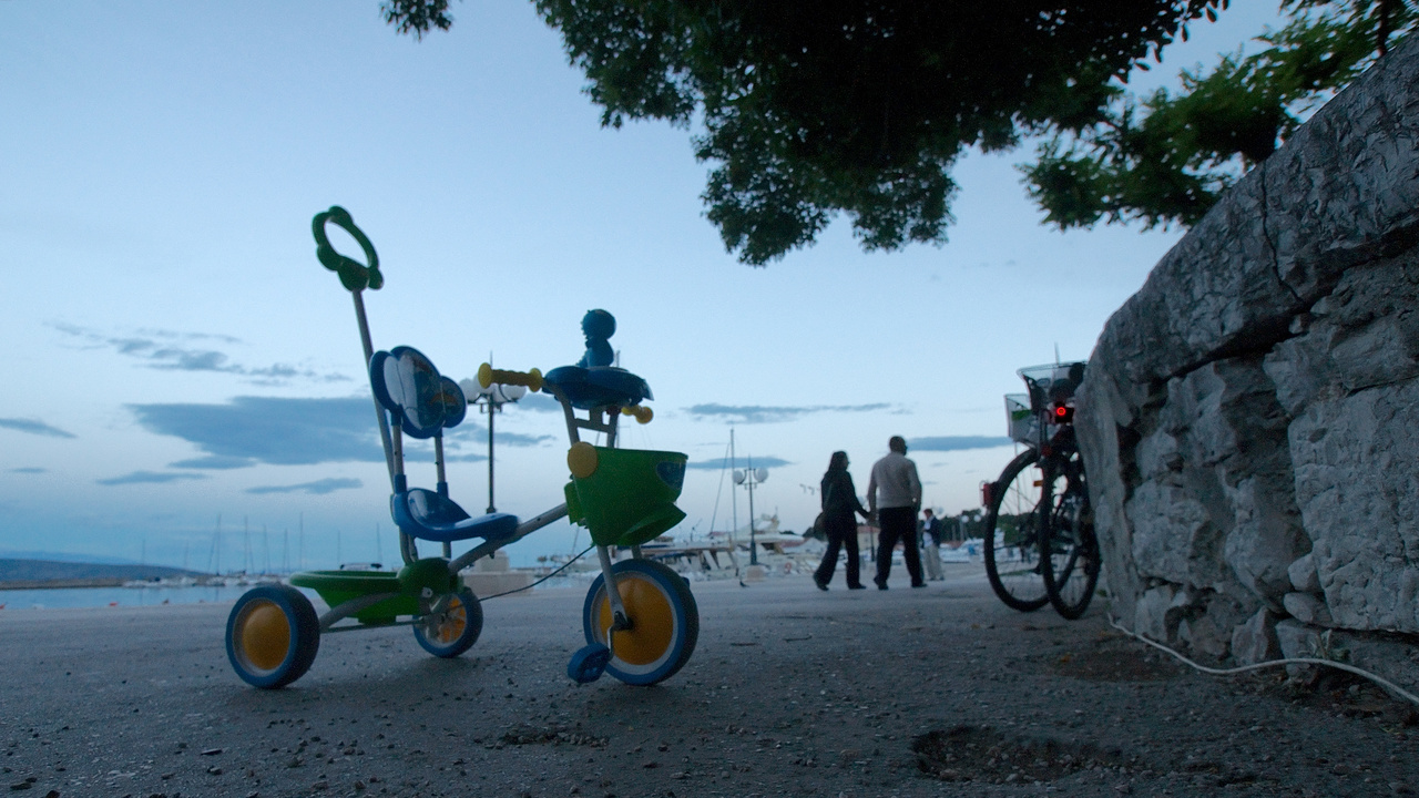
At least since my unexpected encounter with Eggleston’s famous trike on a Honda Poster (here) I am somewhat sensitized for those small vehicles. So my heart leaped for a moment when I saw this symphony in blue, consisting of that chinese-made little threewheeler and the harbour scenery and intensified by the red tail light. Of course the trike did not stand in the right position for the image, so in constant fear of an impulsive accusation in croatian language I carefully repositioned it and took 4 handheld frames at slowest shutter speeds from the lowest position possible – difficult without an angle viewfinder or lifeview. The image is not 100% sharp due to camera shake, but nevertheless a keeper for me.
😉 – I like it, too.
— me again — was thinking about this photo. Somehow the “not 100% sharpness” adds to its impact. Strange, isn’t it? To me, it’s one of the most memorable of your work so far … (besides the hat in the caravan and the typical German staircase … )
Thanks for the praise, Martina! Sharpness is, well, sometimes a more technical aspect of an image, often but not always a substantial one. I grew up with Ernst Haas’ “The Creation” and Will McBride’s grainy images, so one could think that this could have impregnated me somewhat against the overemphasis of the mechanical aspects, but it did not (maybe godfather Adam’s perfection was too alluring, and technical improvements are easier to measure). I had to grow into quite an old photographer before I was able to accept images with visible technical flaws. But I am progressing, I hope.
A wonderful image, Markus. And I agree that the slight softness adds to its appeal. But the best part is the color and the point of view.
Thanks, Paul. For the point of view the praise has to go to Eggleston – this was his idea, and I remembered it as appealing, especially in this light situation. I had tried a frame from normal eye height, but the background was cluttered and the image bad. But in this situation I was lucky to find colors in the tricycle that corresponded well with the sky. And even the red rear light on the bicycle added value in the end to the image – in the first moment I was a bit upset as those bikes got parked there immediately in the moment I was finding the right position for camera and trike. Btw – the walking couple are the bicycle owners, on their way for a promenade and some ice cream. Oh yes, and only seconds after I had finished taking pictures and re-positioned the trike, the owner’s mother came to pick it up.
Intriguing photo, Markus. I am very drawn to it and find myself just staring at it and studying the scene.
I am glad you enjoy it, Martha! The wonderful evening sky, barely balanced by the small red rear light, matches the blue of the trike and creates a wonderful quiet mood for me.
The designers of this tricycle were very smart to use kid colors. I’m sure many a young child would choose it over others if given the choice. I like how you’ve positioned it and the low angle features it well. Looks like an advertisement.
Sherri, I am glad in this case the kid colors are on the harmonious side, and the designers did not feel compelled to include every color in the spectrum. It’s hard to sensitize children for nuances when all their surroundings are just shrieking, being it colors or sounds or flavourings. My own daughters I try to bring up with as little TV as possible, encouraging them to read and paint and so on. At the moment I have the feeling that it works.