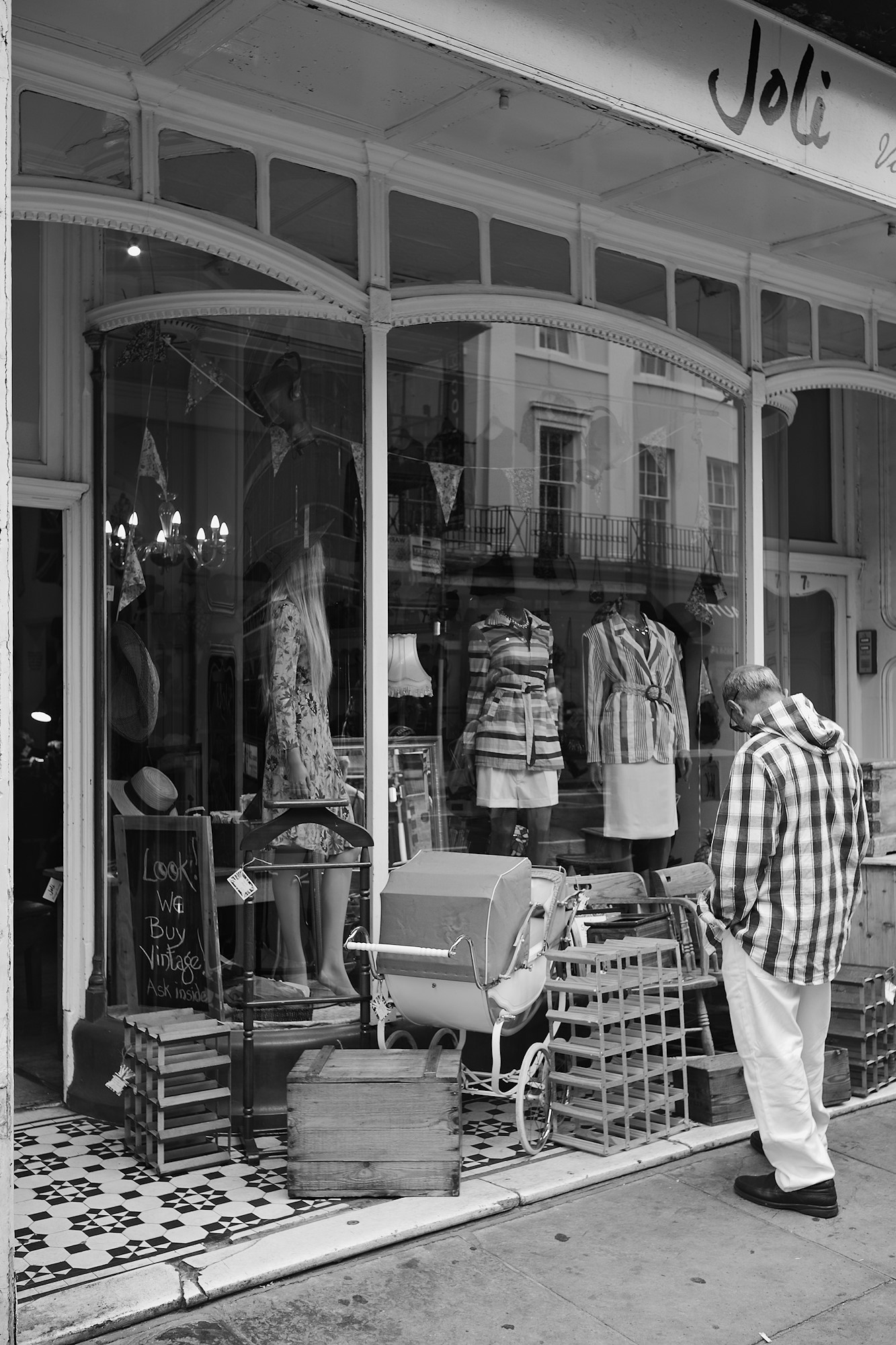
Hat die Entscheidung fürs Schwarz-weiß bei den Lobdonfotos formale oder eher inhaltliche Gründe? Bei diesem Foto hier mit den vielen Stoffmustern könnte die Farbfassung eine geradezu explosive Wirkung entfalten, oder? Gruß Uwe
Uwe, irgendwie sehe ich zur Zeit eher SW als farbig – dass ich den elektronischen Sucher auch noch auf Monochrom gestellt habe, tut dann sein Übriges. Mir fällt es leichter den Bildinhalt zu organisieren, wenn ich die Farben aussen vor lasse – und in ganz vielen Situationen erlebe ich eher Kakophonien. Aber in diesem Fall hast Du Recht – dieses Bild ist farbig mindestens genausogut!
Hi Markus, I have been enjoying your London photos. Your posts over the last few days remind me of the work of Chicago photographer Harry Callahan, especially your warehouse windows and street photos. Hope you continue to have a good time in London.
Thanks, Jeff. Unfortunately the family vacation in London is already over, but we did our best to squeeze as much as possible into that week, including a visit to an “Othello” performance in the Globe Theatre.
It’s a very small detail, but what struck me was the contrast between the stripes on the mannequins and the plaid of the man’s shirt. Also how the pattern of the plaid is echoed in the squares of the items on display and the windows that are reflected in the glass.
Well observed, Tom – for me b&w even in the viewfinder seems to be an advantage in recognizing such structures while not getting distracted by the colors.
Hat die Entscheidung fürs Schwarz-weiß bei den Lobdonfotos formale oder eher inhaltliche Gründe? Bei diesem Foto hier mit den vielen Stoffmustern könnte die Farbfassung eine geradezu explosive Wirkung entfalten, oder?
Gruß Uwe
Hi Markus, I have been enjoying your London photos. Your posts over the last few days remind me of the work of Chicago photographer Harry Callahan, especially your warehouse windows and street photos. Hope you continue to have a good time in London.
Thanks, Jeff. Unfortunately the family vacation in London is already over, but we did our best to squeeze as much as possible into that week, including a visit to an “Othello” performance in the Globe Theatre.
It’s a very small detail, but what struck me was the contrast between the stripes on the mannequins and the plaid of the man’s shirt. Also how the pattern of the plaid is echoed in the squares of the items on display and the windows that are reflected in the glass.
Well observed, Tom – for me b&w even in the viewfinder seems to be an advantage in recognizing such structures while not getting distracted by the colors.