Huhu, ich kann die Schrift kaum lesen – erst hatte ich eben alle browser und os aufgezählt hier, die ich getestet habe, aber ich denke, reicht, wenn ich sage, dass der Kontrast zu gering ist und die Schrift zu dünn. Ich find es gerade sehr anstrengend. Bei manchen Kombinationen geht gar nicht.
Another great reflective image Markus. Also like the clean look of this new theme though I may need to tone down the screen brightness on my monitor 🙂
Just noticed that the words in the post and in the comments seem to wrap around without so much as a hyphen on IE11 and are almost unreadable on Chrome. Maybe that’s just my computer having problems rendering. It is an old beast.
Admittedly I did only a short test on Windows, assuming that any ttf font would render on Windows at least as good as on the iPad or on my Linux box. But it doesn’t…
So for the time being I will first switch to the most simple Arial and then do a new search for a good font. Google web fonts seem to be a safe bet, and probably I will have to resort to that solution, even if it means that I and all visitors of this blog feed their data sink.
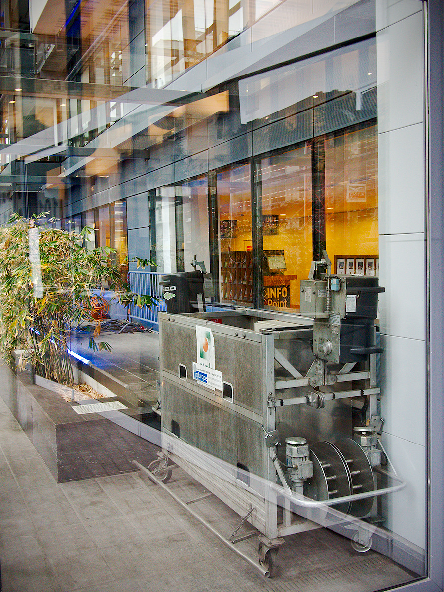
Ich habe keine Ahnung was das für ein Ding ist, aber so etwas Ähnliches habe ich gestern auch gesehen und dieses Ungeheuer wurde benutzt um Spargeln zu schälen :–)
Dein neues Layout gefällt mir sehr, aufgeräumt und klar.
Walter, nachdem es vor einem im Umbau befindlichen Restaurant – oder ein Feinkostladen? – stand, kann es durchaus eine Spargelschälmaschine sein.
Das neue Layout war natürlich viel mehr Arbeit als ursprünglich gedacht – mit Fehlfunktionen bei den Fonts und der Silbentrennung, mit denen ich nie gerechnet hätte – aber inzwischen bin ich auch sehr zufrieden damit.
Ich als Freund des minimalistischen Design freue mich sehr über das neue Layout. So kann ich mich besser auf das verwirrende Spiel der Spiegelung moderner Zeiten & Maschinen in den wunderbaren Bildern konzentrieren.
Weniger ist meistens mehr, und ich bin noch ein Überbleibsel der Generation, die das minimalistische Design von Dieter Rams sozusagen mit der Muttermilch aufgesogen hat, bevor es von Apple zum Lifestyle erhoben wurde 😉
Huhu, ich kann die Schrift kaum lesen – erst hatte ich eben alle browser und os aufgezählt hier, die ich getestet habe, aber ich denke, reicht, wenn ich sage, dass der Kontrast zu gering ist und die Schrift zu dünn. Ich find es gerade sehr anstrengend. Bei manchen Kombinationen geht gar nicht.
Jetzt hab ich zum layout gar nichts gesagt, das gefällt mir sehr sehr gut. Aber ein böses OS macht echt die Schrift kaputt.
The color, the layering, this feels exactly like your aesthetic. Beautiful
Markus, I like the clear theme but I’m not sure about the typography, maybe too much clear. However I imagine it’s part of the theme.
Another great reflective image Markus. Also like the clean look of this new theme though I may need to tone down the screen brightness on my monitor 🙂
Just noticed that the words in the post and in the comments seem to wrap around without so much as a hyphen on IE11 and are almost unreadable on Chrome. Maybe that’s just my computer having problems rendering. It is an old beast.
Hi, Markus,
I’m with Cedric. The text is, sadly, almost unreadable. The photos are still great, though!
Admittedly I did only a short test on Windows, assuming that any ttf font would render on Windows at least as good as on the iPad or on my Linux box. But it doesn’t…
So for the time being I will first switch to the most simple Arial and then do a new search for a good font. Google web fonts seem to be a safe bet, and probably I will have to resort to that solution, even if it means that I and all visitors of this blog feed their data sink.
Ich habe keine Ahnung was das für ein Ding ist, aber so etwas Ähnliches habe ich gestern auch gesehen und dieses Ungeheuer wurde benutzt um Spargeln zu schälen :–)
Dein neues Layout gefällt mir sehr, aufgeräumt und klar.
Walter, nachdem es vor einem im Umbau befindlichen Restaurant – oder ein Feinkostladen? – stand, kann es durchaus eine Spargelschälmaschine sein.
Das neue Layout war natürlich viel mehr Arbeit als ursprünglich gedacht – mit Fehlfunktionen bei den Fonts und der Silbentrennung, mit denen ich nie gerechnet hätte – aber inzwischen bin ich auch sehr zufrieden damit.
Ich als Freund des minimalistischen Design freue mich sehr über das neue Layout. So kann ich mich besser auf das verwirrende Spiel der Spiegelung moderner Zeiten & Maschinen in den wunderbaren Bildern konzentrieren.
Viele Grüße & weiterhin sichere Straßen, Fritsch.
Weniger ist meistens mehr, und ich bin noch ein Überbleibsel der Generation, die das minimalistische Design von Dieter Rams sozusagen mit der Muttermilch aufgesogen hat, bevor es von Apple zum Lifestyle erhoben wurde 😉