That little guy was pretty fast – on three legs! I found his colour – matching the bricks – really appealing, and the wall base gave just enough contrast to make him visible in a very low profile way.
When searching for a title I had assessed the pros and cons of including him – knowing that it would set up a kind of a challenge. But then this is a (cheap but) successful trick to keep the viewer’s mind engaged
As with Cedric…I like this picture, but it shows a real limitation of displaying our work in this form. Without your label, I might not have spotted the running dog, while I’m sure I’d have seen it right away in even a modest size print. Blogs let us reach a much larger audience, but we don’t reach them with the same “product” we do when showing prints. I sometimes add a cropped “detail” image to help the viewer spot small but significant elements, but it still ain’t the same as looking at a real print.
Carl, a blog is certainly a wonderful way to find audience and start communication, but photography goes well beyond what a screen can do. The best example is the wonderful Pt/Pd print of “The Pike” from you – it’s a sensual thing, too. And whilst I have started to get some prints 7×10″ lab prints every month, I found that “real paper” as a print basis is even better – not resolution wise, here a new ipad might help, too, but in the sense that a photograph is an “artefact”, too. Holding a print in the hand is something completely different.
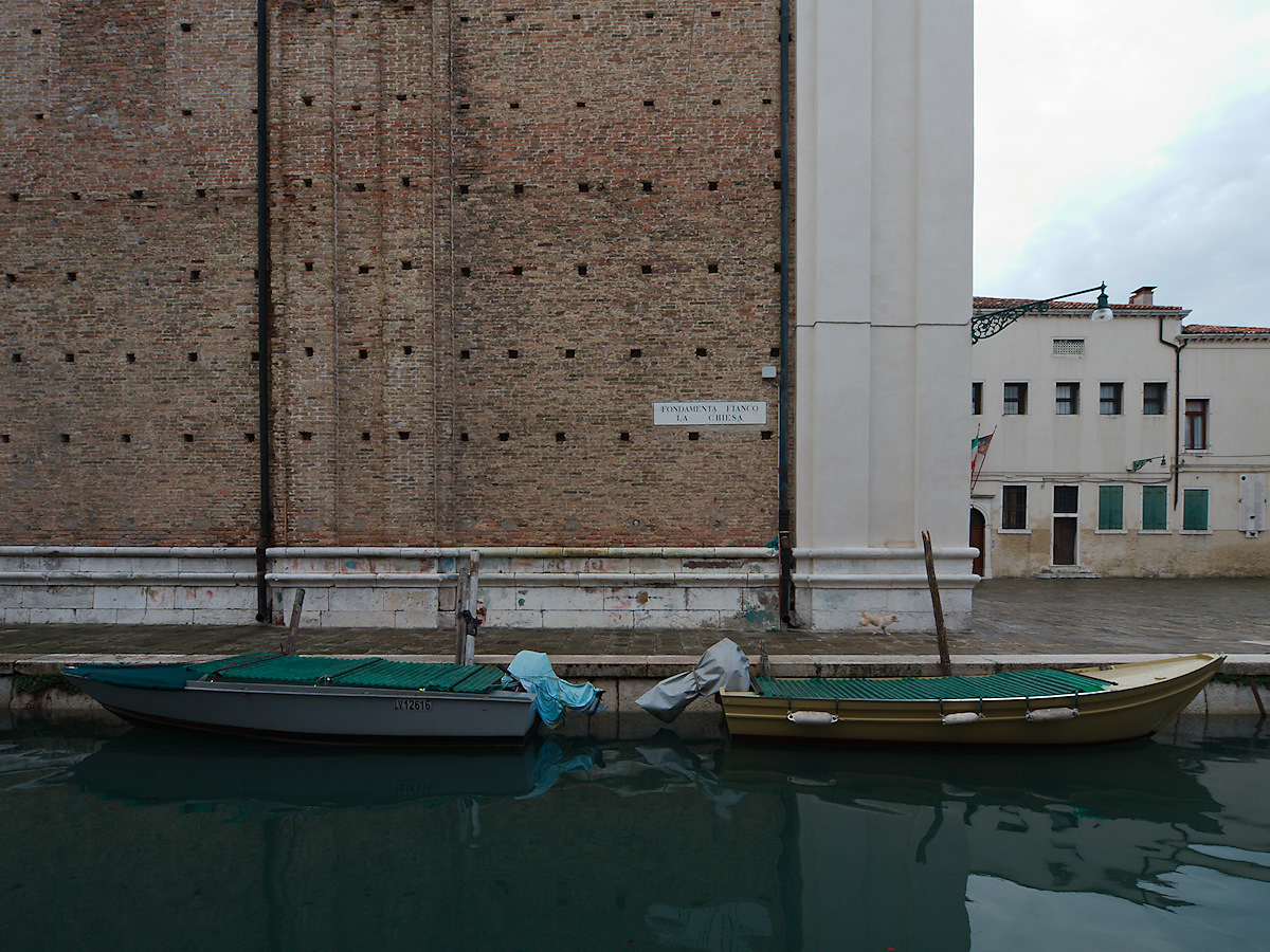
Took me a while to spot the dog 🙂
That little guy was pretty fast – on three legs! I found his colour – matching the bricks – really appealing, and the wall base gave just enough contrast to make him visible in a very low profile way.
When searching for a title I had assessed the pros and cons of including him – knowing that it would set up a kind of a challenge. But then this is a (cheap but) successful trick to keep the viewer’s mind engaged
As with Cedric…I like this picture, but it shows a real limitation of displaying our work in this form. Without your label, I might not have spotted the running dog, while I’m sure I’d have seen it right away in even a modest size print. Blogs let us reach a much larger audience, but we don’t reach them with the same “product” we do when showing prints. I sometimes add a cropped “detail” image to help the viewer spot small but significant elements, but it still ain’t the same as looking at a real print.
Carl, a blog is certainly a wonderful way to find audience and start communication, but photography goes well beyond what a screen can do. The best example is the wonderful Pt/Pd print of “The Pike” from you – it’s a sensual thing, too. And whilst I have started to get some prints 7×10″ lab prints every month, I found that “real paper” as a print basis is even better – not resolution wise, here a new ipad might help, too, but in the sense that a photograph is an “artefact”, too. Holding a print in the hand is something completely different.