Carl, I too have a ambivalent feeling regarding graffiti: The easy cases are the just aggressive, ugly ones, tagged like a dog is marking a corner. But sometimes they really fit the place, being it because concrete deserts themselves are ugly and inviting to be decorated, or like here, where a graffiti can fit in. Its a defacement nonetheless, and a house owner I would be more than unhappy, but from an aesthetic point of view, graffiti can have their merits.
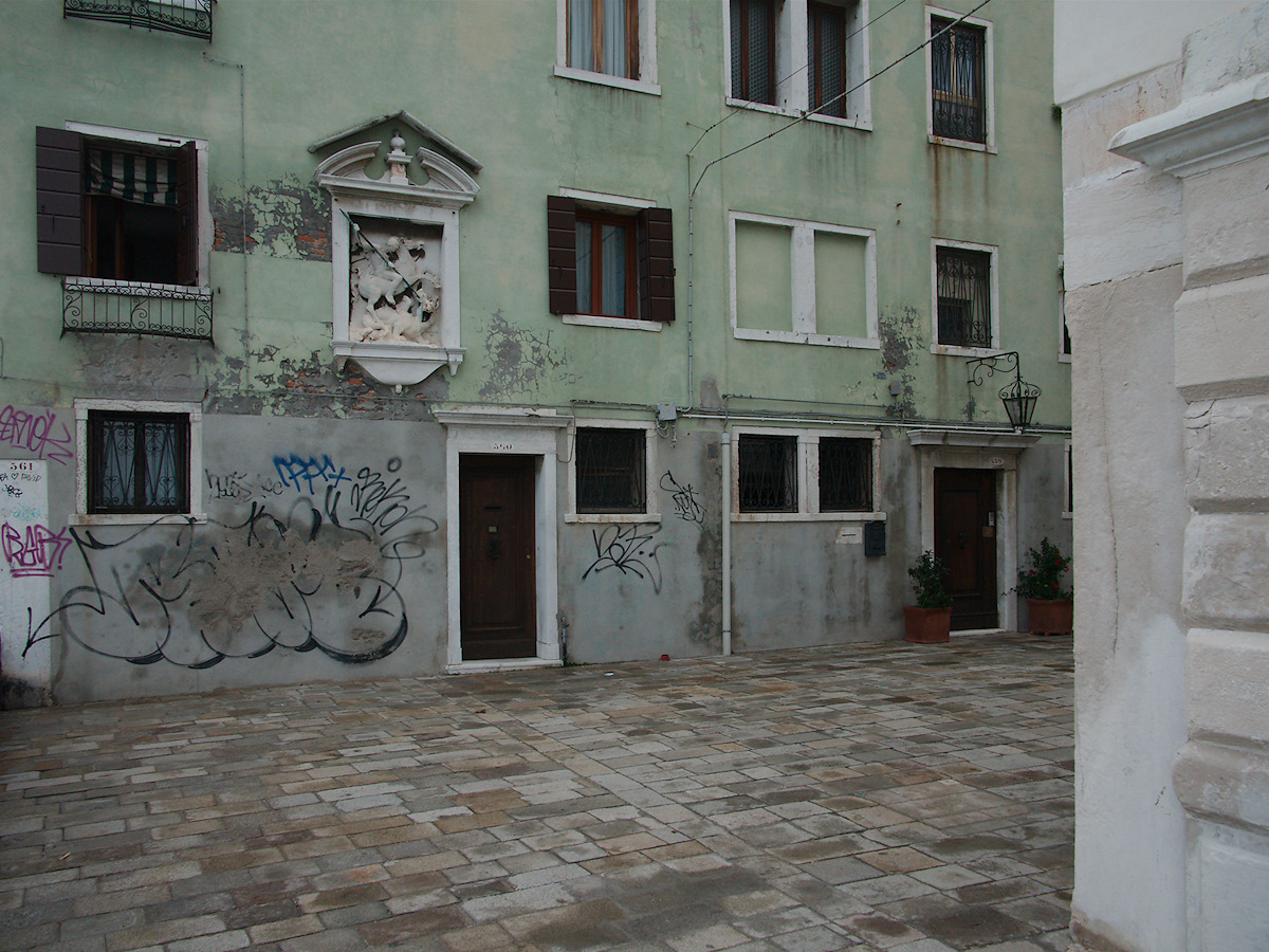
That soft color is great. As much of defacement as the graffiti is, the colors actually harmonize pretty well with the pastel green of building.
Carl, I too have a ambivalent feeling regarding graffiti: The easy cases are the just aggressive, ugly ones, tagged like a dog is marking a corner. But sometimes they really fit the place, being it because concrete deserts themselves are ugly and inviting to be decorated, or like here, where a graffiti can fit in. Its a defacement nonetheless, and a house owner I would be more than unhappy, but from an aesthetic point of view, graffiti can have their merits.