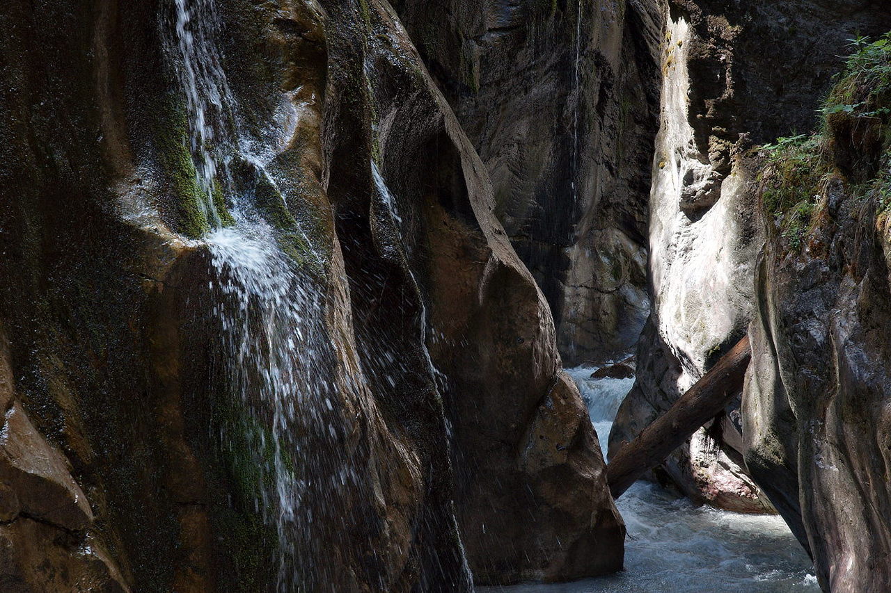
Images with two centers of interests have have to fight the problem of diverting the attention of the viewers focus. I hope the staging here is sufficient to give enought attraction to the nearer cascade before the gaze wanders to the bright spot in the background – and hopefully comes back. It’s a risk, but then it probably also is Robert Frost’s “road less traveled”.
Markus, my eye went first to the bright spot and the diagonal lines of what appears to be perhaps a log wedged into the canyon, but then as my view widened it came back to the nearer cascade with the sudden realization, “Wait there is much more to this than first imagined.” While perhaps not the sequence you chose, it delivered much more then first promised and for me works well indeed.
Earl, preconceiving the way a viewer will see the image is difficult. I am glad it worked for you! Meanwhile I have created a version where the small cascade is more prominent by a bit brighter tones and more contrast. I guess I will have to get prints and compare those.
It could work as you intended, but I would brighten the left half of the photo a bit. At least on my screen and for my eyes it’s a tad too dark there, you seem to lose a bit structure (and attention) in the shadows of the rocks.
I like the strong diagonalism in the picture, especially the log that moves from low/left to top/right, i.e. opposite to the majority of diagonals of the rocks.
Thomas, thanks for the constructive help. I finally managed to create a modified version, using bibble’s regions to selectively brighten the small cascade.