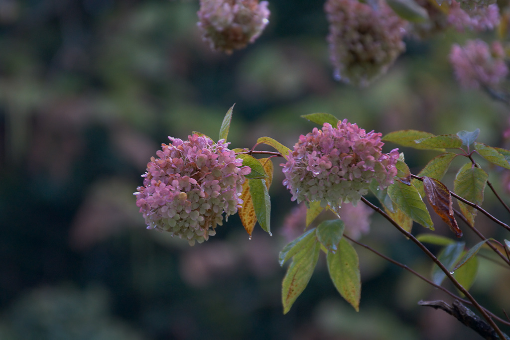
Just opposite my window is a really old hydrangea in, and this is special, tree form. Usually hydrangeas are shrubs, but this old specimen grows its efflorescences on a real stem and branches. And probably 2m over ground they collect all the dew from the cold and humid autumn nights, and in the blue morning light the remaining pink of the petals glows. I have already lowered saturation a bit, but probably this is still not enough – pushing down exposure by 2 stops to compensate for exposing to the right gets wonderful colors, maybe a tad on the artificial side.
Markus, that’s a wonderful hue of pink you’ve captured. It doesn’t look artificial to me…my taste tends to go more towards vibrant colors. The beautiful soft background Bokeh which has touches of the same pink really support and draw the eye to these central petals.
Hm I think saturation is definitely okay (like Earl said) – the photo really gives me that special autumn-wet-fadedcolours feeling.
Your observations about color and exposure are similar to my own, Markus. When I do an exposure series to make sure I have, in fact, “exposed to the right”, I often find that the color does change as I pull down the exposure in Lightroom (with oranges, yellows, and reds becoming more saturated) . But more interesting, I think, is comparing that color to the color of the same image that was underexposed and then “pulled up”. The color of that image seems even more saturated than the first one, even when their respective luminance level is about the same. I’ve actually sometimes chosen the underexposed image, assuming that the shadow areas aren’t blocked up and are relatively noise free.
Paul, experimenting more with images that are biased to the dark side of the histogram, it seems that this color shift is influenced by the transformation curves the raw processor applies. There seems to be some background ‘magic’ working that tries to make the images more vivid, and shifting the tonal values around therefore gets accompagnied with such shifts in hue and saturation. Still I don’t want to complain, because I have more control over my images than I ever had before, and experimenting with immediate feedback and without material costs is definitely on the pleasant side.