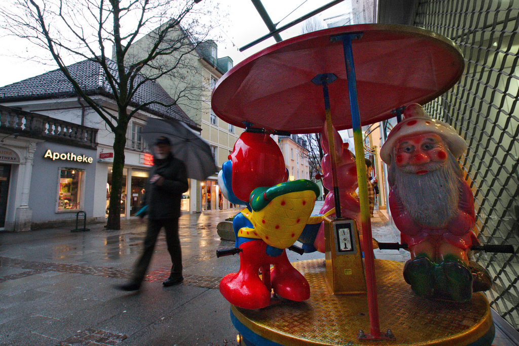
taking up carl weese‘s question and implicit suggestion to present in color what gets it’s ugliness through color.
and note to self: stick with either portrait or landscape if you want to make it a series. a lesson i should have already learned from my krk images…
hometown monstrosities in color


Perhaps because of the rain … the play is still quiet from the children. In my city, there are many toys such as this. But can only be met in the Mall. Nice atmosphere foto. Regards from Yogyakarta City, Indonesia //
Wow, they really ARE ugly!! Nice job.
I don’t see as many of these anymore. Perhaps I just don’t notice them because I have no small children anymore.
Very colorful indeed. The characters in the top one are kind of scary looking.
Brr… sometimes B&W photos (as in your previous go for the monsters) give a bit more distance to the subjects. Which in this case is something I really appreciate! 😉
Good shots, but I can only agree: Landscapes or portraits are certainly a more enjoyable sujet…
“Ugly” enough for children to love it 😀
Here in Lisbon we have this kind of “montruosities” spreading all over…the worst part is when they get the coin and star to “sing” 😀
I love the first image. Kinda funny to see how everybody – people and “toys” hides from the rain under umbrellas 🙂