I had planned to show more diptychs, but with the current means of presentation I am a bit unhappy: Combined as one image, the current blog layout shows them so small that they become quite unattractive. Of course clicking on the image enlarges it, but the first impression is not inviting. I started to experiment with some blending methods, but the day job proved to be more time-consuming than expected.
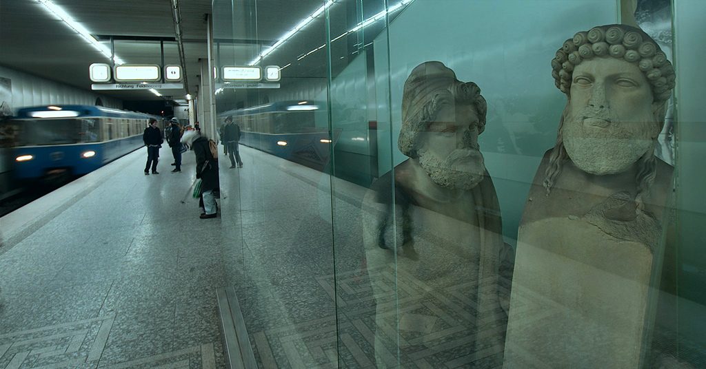
So today’s image is a snap taken when returning from a meeting via subway: One of the stations, next to the museum quarter in Munich, exhibits some replicas of greek statues, hijacked by a graecophil Bavarian king and since then shown in a local Museum.
The raw image was converted in bibble5, and I used a LAB plugin to emphasize the greenish light. But for the last treatment I had to resort to digikam’s local contrast enhancement function, without it the image was too “flat”.
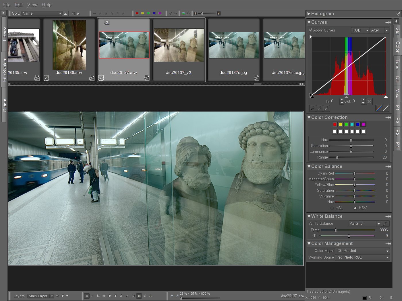
Update: I added a screenshot of bibble5 in action on this image. In the top row you find the thumbnail of the unmodified raw just right to the highlighted thumbnail. The effect of the LAB modification is the extreme narrowing of the blue and green values. The tint was achieved by moving the grey point of the histogram out of the center towards darker.


Markus, I love that you shot at an extreme angle down the glass. Not only were you able to feature the statues but you also caught the converging lines of the platform, lights, train as well as their reflections. It really gives the photo depth and the train adds a sense of motion. I think the green lighting works extremely well. Wonderful composition and post-processing.
Reflections and motion blurred, fast moving trains. Superb!
Markus, I love this. The crispness of the statues balanced against the motion-blurred train is wonderful. As for the color, to my eye what has happened is that you have moved the usually obnoxious green tint of the discontinuous-spectrum lighting into a mostly cyan balance that retains the “weirdness” of this sort of light but tamed its impact. I’m going to explore this.
@All: Thanks for the kind words. I think without the postprocessing it would be a quite trivial image. To illustrate the modifications done in bibble5 I have updated the post and added a (clickable) thumb of a screendump, showing what I did.
Carl, the lighting the use is translated into a more yellowish cast with a green tint in the shadow areas where the statues are placed. That way it looked uninteresting to me, especially as the detail of the mosaic replica on the floor got lost in the color impressions. This was the main reason why I moved it into the monochrome direction.