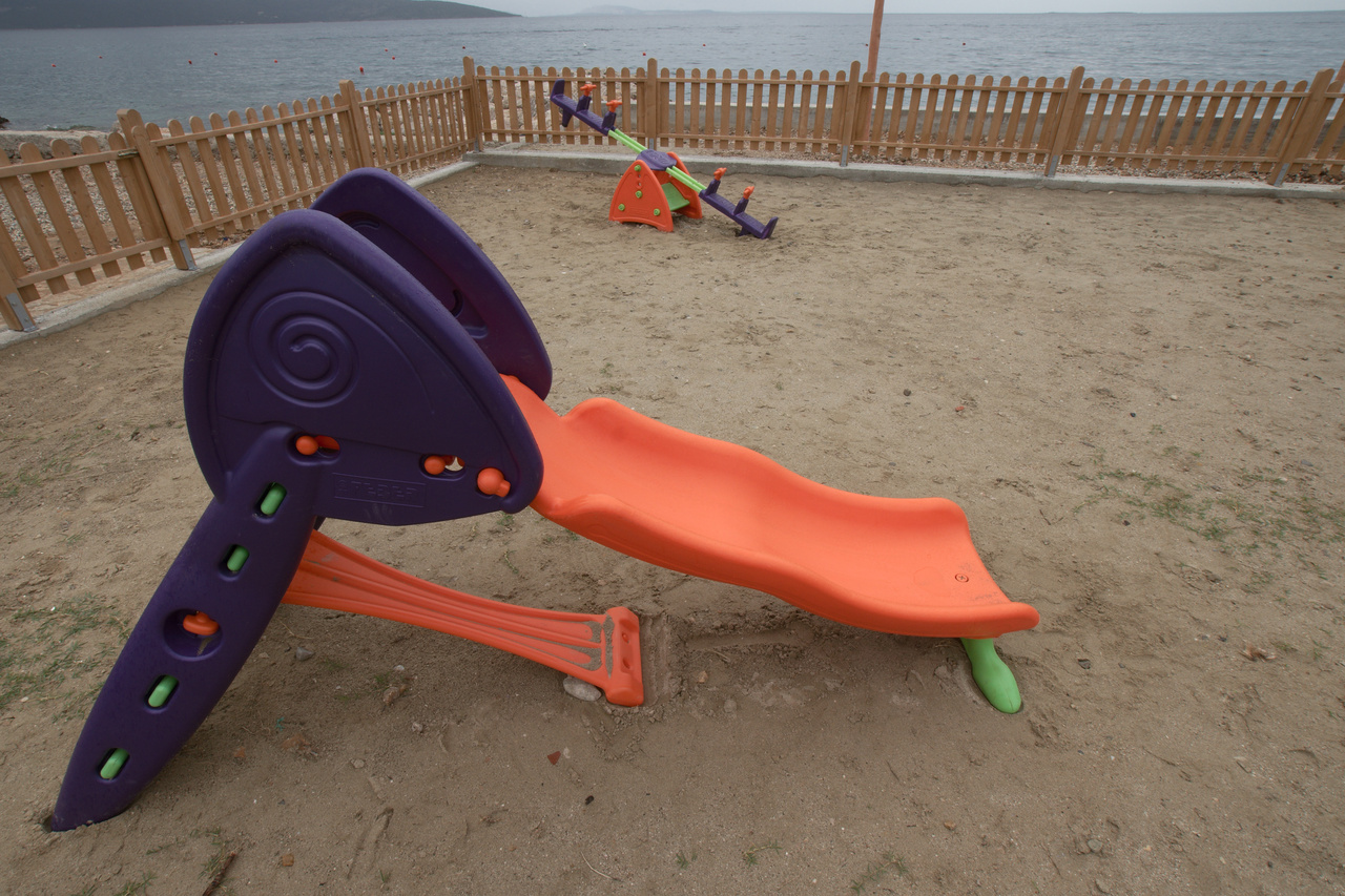
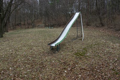
Sherri’s remark on the “kid colors” of the Egglestonian trike reminded me of the slides on a playground in Krk, and recently searching through Carl Weese’s Pennsylvania images brought that Wadesville playground slide to my attention. What a difference in the obtrusiveness of the coloring.
Personally I am less than convinced that we do kids a favour by presenting them such a color overkill like in the image above. I do fear that this conditions their perception to strieve for “louder, shriller, pushier”, and this principle is going to be applied not only to toys, but, to name a few, food, TV, school entertainment and the like. The designers of these (probably chinese) cheapo plastic slides have certainly accomplished a leap towards that kind of perfection, and the overall (sales) success probably proves them right. The trike in my earlier image has in comparison harmonic colors, and I won’t contradict Sherri regarding the attractiveness towards kids.
As for the owners of the playground, I believe these plastic/rubber slides and other equipment appeal on safety and liability grounds. That bright orange and purple slide is probably safe and appealing for a child but no doubt it’s pretty dull as well, where-as a taller metal slide would be more fun and of course more dangerous.
When I was growing up sliding down those tall metal slides, there wasn’t a lawyer and lawsuit awaiting around each corner — or the thousands of dollars of insurance required for opening even a simple playground.
It’s for certain a different day, and there’s reasons to be sad about that.
Earl, complementing safety and liability reasons there seems to be the price issue – those plastic thingies cost only a fraction of a sturdy structure, and they won’t last long. In this case I would say they are defective by design – just look at the dangling cross beam of the slide – because no engineer took proper care of the joint construction.
The problem of a law suit around every corner is not as present yet here in Europe as it is in the U.S. Here most people and institutions rely on technical inspection authorities complemented by indemnity insurances, and this system works pretty well: the insurances are not too expensive because the indemnifications are kept within a reasonable framework, acknowledged by courts as well as lawyers.
Markus, I agree that the aggressive color of cheap products like these influences tastes in general, even maybe to the tendency for over-saturated high contrast color photographs. I recently got to see a show of vintage prints of New York City color pictures by Saul Leiter, from the 50s and 60s mainly. Not only is his color palette sudued (although the Kodachrome film he was shooting was considered juiced-up in color at the time, it is the height of subtlety compared to something like velvia, or an in-camera JPEG set to “vivid”) but also the materials of his subjects were more subtle. There is paint, and ink, but almost no solid-color plastic materials. The pigments in the paints and inks are mainly natural. Fabrics are wool and cotton with natural dyes, not nylon and other plastics. You literally could not walk around NY and make pictures with this same mood today, even if you made your digital camera do a perfect mimicry of Kodachrome II, because the subjects and surfaces have changed dramatically.
Carl, this development towards more intensity of course has a long history. I do remember my visit to Peru 1980 where you saw the indian patterns woven both in plant dyed and anilin dyed wool. And since then the synthetic coulors have taken over more and more places and applications, at the same time they improved intensity and durabilty. Yes, kodachrome in those days was comparably vivid (but even more contrasty, especially when a bit underexposed) but taste since then has changed. Mainstream for sure are the saturated, sweet colors, and at the same time flavour of food and dynamics of music have intensivied too. I do not negate the possibilty to perceive this as an enrichment, but when this is mainstream, I think the subtle, nuanced things become the real enrichment. The problem left is the lack of sensitivty for subleties as soon as the taste is spoilt.
Markus, certainly sheer sound volume in pop music has accompanied this move to grossly saturated color. But flavor in food? Certainly not over here. The devolution of American food has led to a palette that can only taste sweet, salt, and fat. Hence the American lunch at a fast food chain with a 900 calorie burger and 600 calorie “milkshake.” And don’t forget the fries, whose only flavor is fat and salt. Those are the flavors that have intensified, so it seems people can taste nothing else. So maybe you’re right, that may be the same as only seeing oversaturated color and hyped up contrast in a photograph. Could a McDonalds patron taste what’s good about fine cuisine? I suspect not.
Carl, that’s exactly the point: flavour nuances are leveled and replaced by the lowest common denominator. Add to this the global presence of McDo, KFC et. al. and for great parts of the population the variety of flavours will diminuish. I do well remember my horror when I read “Guaranteed artificial flavour” on a lemonade bottle somewhere in Asia.