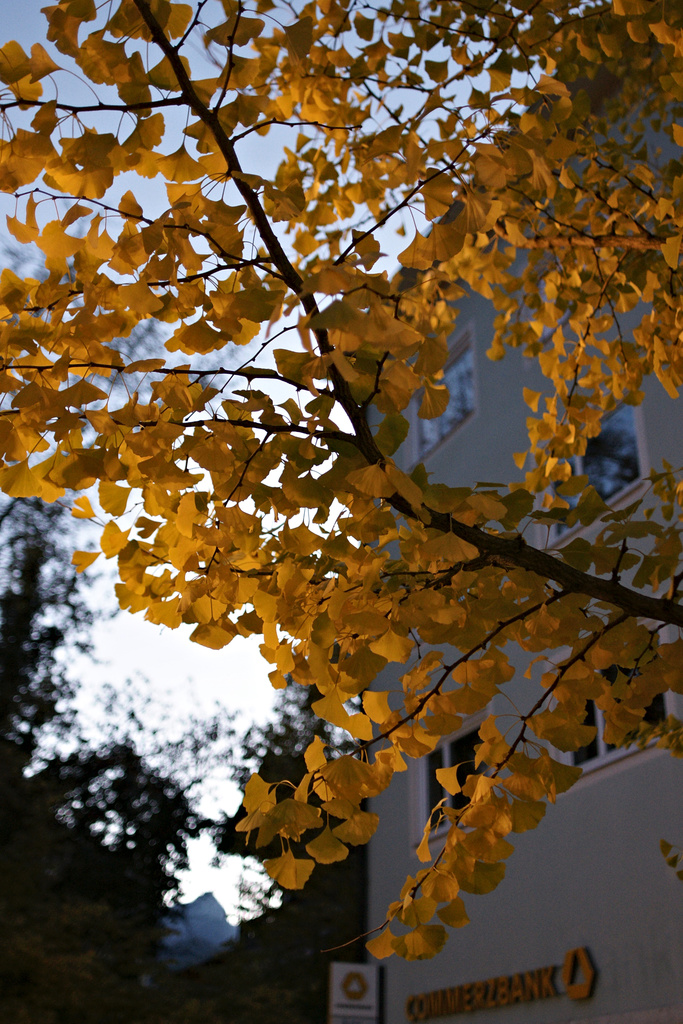
The walk home after a long day commuting to the office brought and unexpected picture: Progressing autumn had coloured the Gingko tree’s leaves yellow, the spotlight from below enhanced it and the night sky had just the right brightness as a contrast.
However it did not meet me unexpected: I had already seen other trees in different states of foliage, with different lights and different states of the evening sky, but in spite of carrying the camera I did not bother with making an image – in the viewfinder, the scenery did not form an image.
This process of deciding when to try an image, of estimating the pictoral power of the elements is still a mysterium to me. And while I am intently following the Landscapist’s series of posts On Seeing, I have still not found even a thread that would allow to untangle that mysterium. Instead I have decided to practise, not letting the theoretical discussion completely fall below the horizon, instead hoping for something like a critical mass that would suddenly bring a great leap in the process of understanding.
I do know this procedure from my day job as GIS analyst/programmer, where I sometimes spent days on a single problem, then got diverted, read and gained knowledge and practice by doing, and suddenly the first problem got resolved – not by determined analysis, but by a broad gain of knowlege and skill.
So I keep my fingers crossed that this works in photography in a similar way.
While the posts about seeing (from The Landscapist) are very interesting, it’s important to not over-think and image before taking a photograph. This is especially true in digital imaging, where a photograph costs almost nothing. If you were shooting large format film, with each shot costing lots of money, you would need to be very picky about what you shot, unless you had very deep pockets. Fire away and edit later.
Ken, those approaching-zero marginal costs definitely helped me to learn and develop my photography. I started 30+ years back with b&w and an improvised darkroom, and for a student the costs of every 8×10 print were substantial.
The fine thing now is that it’s easy to select the top ten every month, and get them printed only after thinking and processing, pretty much the same way I earlier did in the wet darkroom. And as now creating is possible so effortlessly, I got even more interested in the creative process behind it. This is where I do enjoy interaction on the net so much.
And funny how the leaves’ colour correspond with the Commerzbank sign, 😉 – I first thought this was by intention – but you don’t mention it in your comments.
Martina, this was for a long time was a Dresdner Bank, advertising “Mit dem grünen Band der Sympathie” (With the green ribbon of sympathy). When I took the image I had to look twice because I had fully expected green neon letters in that place – which would obviously have completely changed the color palette. I was just lucky that the Dresdner Bank merged with Commerzbank some time ago, providing the right colors for my image.