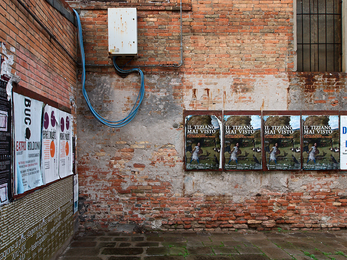
What I really like here is the combination of the blue wires upper left and the green stuff (grass, moss?) between the paving stones—the way they contrast to the warm red overall color from the brick wall. It all balances in a wonderfully irregular way.
Carl, since quite some time I am following an idea of “oligochromic” photographs, i.e. images that usually exclude one primary color. And whilst I don’t try to force it, I have experienced that this kind of color usage really does please me. And here it works really well, with both blue and green adding enough complexity and sub-centers in the image to keep the viewer interested. What I enjoyed (ex-post – I wasn’t aware of it when framing) are the small repetitions – the blue in the posters at the left and right borders, the green in the trees of the center posters. It seems a fine and balanced scenery has found my eyes and sensor here.