
![Click to enlarge: Rain In The Hill Country [f/4, 1/100 sec, 12mm-e, ISO 400, DMC-LX3]. Tagged with](https://markus-spring.info/wp-content/uploads/sites/2/2011/07/p1010487b.jpg)
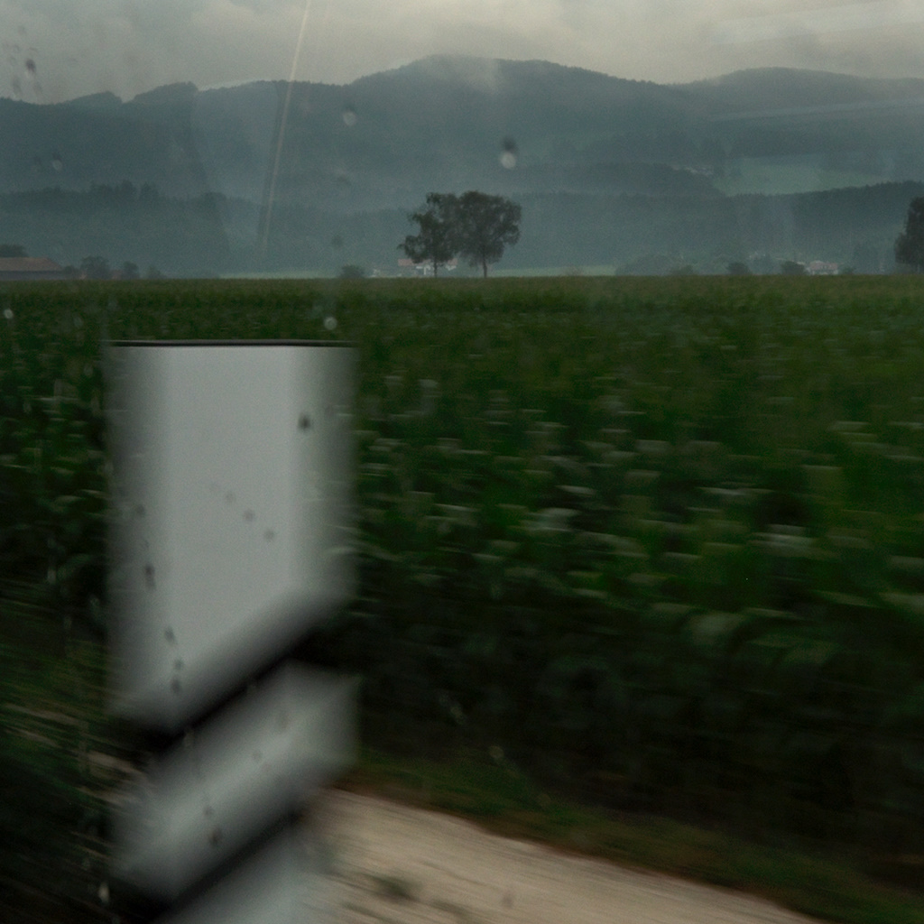
Update: Following a conversation with Carl Weese, I created a new version of the first image, removing partially the color cast in the first image. To the right is the version posted originally, for comparison.
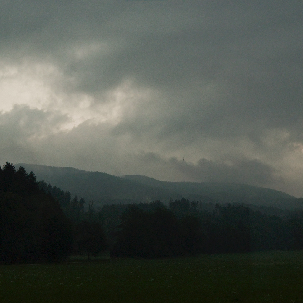
Only one day later, commuting home, the scenery had changed completely, when rain had washed away all romantic assets.
These are going very well. I particularly like the first in this post, except…
The strong cyan color cast doesn’t convince me. I’m sure the train windows are tinted, and some of the effect should remain, but I think a viewer right there next to you wouldn’t have seen the color that way. Tinted windows like that create a sense of distance, of separation, but our perception quickly adapts and doesn’t see the scene as green/yellow.
Carl, I admit not having paid proper attention to the colors – after work hours on a tiresome day are not a good precondition for imaging work. Additionally to the correctly identified problem source of the tinted windows I guess I also fell prey to one of the rare little flaws of the LX3, a quirky whitebalance with mostly green subjects. I do remember I got an image where concrete turned lilac under similar lighting conditions with this camera.
So I will revisit my raw files and get a better balance, especially a neutral grey on that utility box in the first image.
Markus, here’s something to experiment with. When the subject has a strong color cast, as here because of the tinted window, or just because the ambient light is strongly colored, the AWB will often fail to correct for this. So the next step is to “correct” the WB by targeting a neutral tone somewhere in the picture, or by using a reference capture of something like a WhiBal card. But this balance is also likely not to look quite right. After all, the scene was in fact oddly colored, and taking away all of that may not be the best answer. So the next step is to back off the “correct” balance a little bit toward the under corrected one to find a convincing result. BTW, I find the second of these two to have a color balance that’s nicely convincing.
Carl, your last comment came just in time as I was already sweating over the whitebalance in search of the best middle grey point – the utility box wasn’t, but sky was much better. Which is understandable, as the box must have gotten greenish reflected light from the corn plants.
What I learned additionally from this images is that I have to check the calibration of the monitor – srgb in the browser shouldn’t be so far away from the bibble image as it is now.