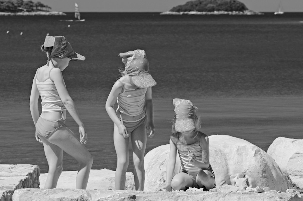
taken during our holidays in croatia. whilst the color version is interesting in its own, i do like the graphical effect of the black and white here even more as it leads the eye more to the curve of the heads.
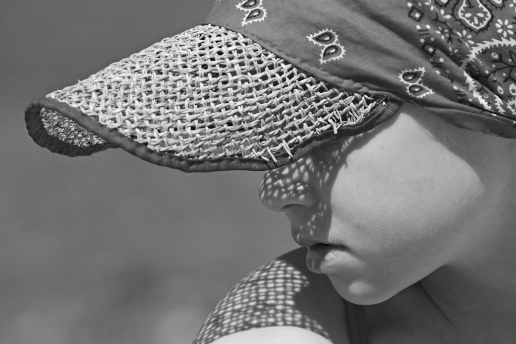
this abstract portrait i love for the patterns and shadows and clear areas. i am still undecided if i should crop it even a bit tighter.
In my mind the crop is just right the way it is. Keeping some horizon in gives a great sense of depth, and there is obviously no room for cropping from the bottom or left. Cropping from the right might work, but lead to an almost square frame in the end, which might be too static after all.
B&W works also perfectly, it’s a great holiday-flavored photo with a twist!