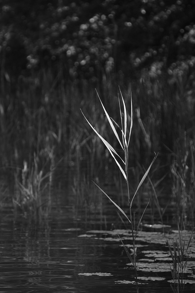
i start getting the taste for b&w again – positve feedback helps. and it makes no sense comparing the b&w version with the color original, because each has merits of its own. and they require different treatment, as i have seen with with the picture above.
Whilst the original needed no extra treatment for the lower left corner, in b&w this region was too bright for me. Thanks to lightzone for linux (hey guys, wake up – we are waiting), this was not a big issue. Their region tools work well and are extremely flexible
like killer instinct
עבודה בחו”ל